Akiyoshi Kitaoka of the Ritsumeikan University in Japan, inventor of countless brain-crushing misperceptions, straddles the realms of visual science and art perhaps more than any other illusion creator today. His newest discovery combines additive and subtractive chromatic schemes to represent opposite ends of an illumination spectrum, bringing new understanding to how we perceive color and brightness.
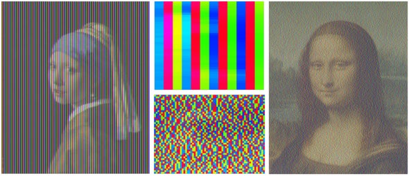
Kitaoka’s breakthrough arose from his realization that he could use vivid colors to create both the dark and bright extremes of the luminance scale. In other words, that he could display full-blast Red, Green, and Blue (RGB) pixels on a screen to generate the perception of not only vibrant hues, but also dim, shady ones—such as depicted in the images at the top of this page [TK].
Using an RGB scheme to represent the dark end of a brightness spectrum meant that Kitaoka needed even brighter colors to portray the lighter end of the spectrum. The candidate hues were mixes of other vivid colors, such as Cyan (blue + green), Magenta (blue + red), and Yellow (green + red)—or CMY for short.
These color schemes—RGB versus CMY—have been used for decades as the most common methods of additive and subtractive color mixing. In additive color mixing, such as on a video screen, RGB pixels mix in different amounts to add up to the desired color and brightness. In subtractive color mixing, such as in printing (e.g. color printers, t-shirts), dyes that absorb light mix with one another. Hence, red light absorption from white light results in Cyan, green absorption results in Magenta, and blue absorption results in Yellow.
By featuring additive and subtractive color mixing in the same image, Kitaoka’s hybrid color scheme accomplishes both dark and light levels of brightness and color, even though each point in the image is blazing at full power.
This “intermediate color mixture” not only bridges additive and subtractive processes, Kitaoka says, but it also reveals that “human vision can distinguish these types of spatial (or temporal) color mixes and perceive every color and lightness from black to white in each image.”