
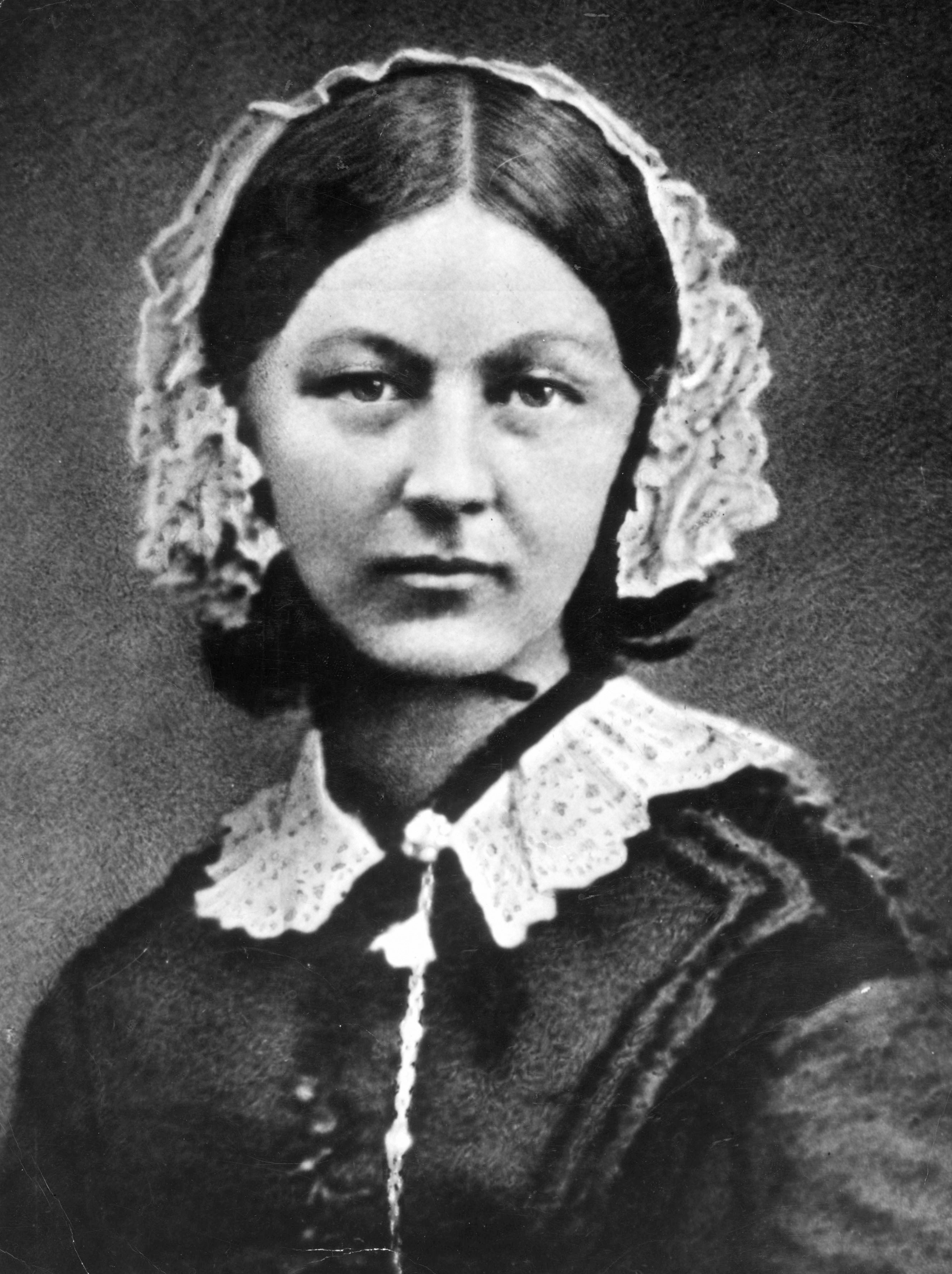
In the summer of 1856 Florence Nightingale sailed home from war furious. As the nursing administrator of a sprawling British Army hospital network, she had witnessed thousands of sick soldiers endure agony in filthy wards. An entire fighting force had been effectively lost to disease and infection. The “horrors of war,” Nightingale realized, were inflicted by more than enemy bullets.
Nightingale had earned the moniker “Lady with the Lamp” by making night rounds on patients, illuminated by a paper lantern. She was serving in the Crimean War, where Britain fought alongside France against the Russian invasion of the Ottoman Empire. The causes of the soldiers' torment were numerous: incompetent officers, meager supplies, inadequate shelters, overcrowded hospitals and cruel medical practices.
Nightingale arrived back in London determined to prevent similar suffering from happening again. It would be an uphill slog. Many government leaders accepted the loss of common soldiers as inevitable. They wrongly believed, for example, that communicable diseases were caused by unavoidable realities—the weather, bad diet and harsh work conditions. And the poor quality of army data made it impossible to know exactly how soldiers died. Patient outcomes varied depending on whether you asked the officer who lost fighters, the ferryman who shuttled the sick, the doctor who treated invalids or the adjutant who buried bodies.
Resolute, Nightingale set out to sway the minds of generals, medical officers and parliamentarians. Their poor data literacy muted statistical arguments that could have oriented them toward the facts. Nightingale, with her quantitative mind, had to persuade people with common understanding but uncommon standing. Her prime target throughout this effort was the head of the British Army, Queen Victoria.
With public attention drifting away from the concluded war, Nightingale knew that the opportunity for reform was fleeting. She worked 20-hour days, mostly behind the scenes, writing letters, wrangling data and publishing anonymously. She did not do it alone—a circle of experts, including statesmen, statisticians and scientists, united with her to break the policy makers' inertia and ineptitude. The team focused its campaign on promoting sanitary reform: fresh air, clean sewers and less crowding.
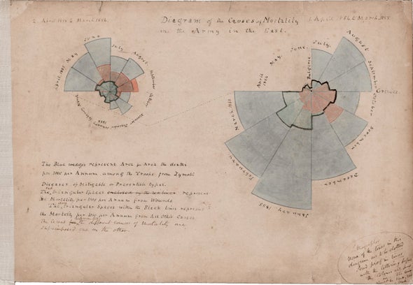
Nightingale's key persuasion tactic was to convey statistics in exciting ways. I recently conducted the first in-depth study of how Nightingale created and used data visualization, and I share my research in the forthcoming book Florence Nightingale, Mortality and Health Diagrams (Visionary Press). I studied correspondence that details Nightingale's information-design process, hand-drawn draft diagrams never before seen by the public and a complete catalog of her information graphics. We can now appreciate better than ever what an innovator Nightingale was and how her techniques foreshadowed how data graphics would become essential to public understanding and debate today.
Recognizing that few people actually read statistical tables, Nightingale and her team designed graphics to attract attention and engage readers in ways that other media could not. Their diagram designs evolved over two batches of publications, giving them opportunities to react to the efforts of other parties also jockeying for influence. These competitors buried stuffy graphic analysis inside thick books. In contrast, Nightingale packaged her charts in attractive slim folios, integrating diagrams with witty prose. Her charts were accessible and punchy. Instead of building complex arguments that required heavy work from the audience, she focused her narrative lens on specific claims. It was more than data visualization—it was data storytelling.
Nightingale's stories showcased how poor sanitation and overcrowding caused unnecessary death. She constructed her arguments from easy-to-understand comparisons. For instance, Nightingale brilliantly framed army mortality by contrasting it with civilian mortality. She showed how, for example, peacetime soldiers living in army barracks died at higher rates than civilian men of similar ages. Her graphics made it impossible to deny the realities represented by the data: army administration needed dramatic reform.
Nightingale's diagrams received broad coverage in the press. Within months after the first batch was published, the issue of overcrowded barracks was debated in both houses of Parliament, which moved to reform the sanitary conditions of the army. This resolution was backed by four subcommissions focused on sanitary construction, health codes, a military medical school and military statistics. Within a couple of years the quality of British Army data soared under the leadership of a Nightingale ally. The new data-collection operation—eventually lauded as the best in Europe—also proved the success of the sanitary reforms: mortality from preventable disease among soldiers declined to less than that in the comparable civilian population. Nightingale celebrated this milestone with a final Crimean War diagram, published in 1863.
Her campaign's biggest impact on civilian public health took another decade to materialize. The reforms Nightingale fought for were finally codified in the British Public Health Act of 1875. The legislation established requirements for well-built sewers, clean running water and regulated building codes. The law and the precedent it set worldwide would be driving forces—along with the development of vaccines that conferred immunity to diseases and artificial fertilizer that boosted crop yields—in doubling the average human life span during the following century.